
Let’s talk about the underdog.
Orange is the color people apologize for liking. Nobody walks into a branding meeting and says “I want it bold, I want it confident, I want it orange.” Red gets respect. Blue gets trust. Orange gets… a nervous laugh and a “maybe just as an accent?” It’s the color equivalent of the friend who’s genuinely fun at the party but never gets invited because someone decided years ago they were “a lot.”
Here’s my hot take after two decades of doing this: orange is wildly underrated, and the only reason it has a reputation problem is that most people have only ever seen it done badly. Done well, orange is one of the warmest, most magnetic, most human colors you can put on a brand. Let me make the case.
The Feeling
Orange is red that went to therapy.
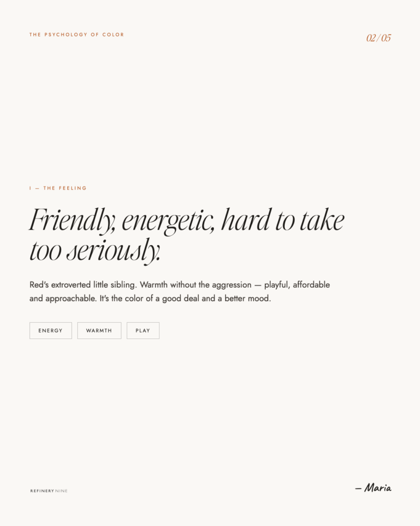
It’s got most of red’s energy — the warmth, the heat, the get-up-and-go — but it dropped the aggression on the way. Red grabs your wrist. Orange throws an arm around your shoulder. It’s stimulating without being alarming, energetic without being a warning. You don’t get “danger” from orange. You get enthusiasm.
There’s a reason orange feels like a sunset, a campfire, a glass of something cold on a hot day, the exact light at golden hour when everyone suddenly looks great. It’s the coziest part of the warm spectrum. It says come here, this is fun, you’re welcome at this table. Where red raises your pulse, orange just makes you feel a few degrees warmer — like walking from a cold room into a sunny one.
It’s also, and I cannot stress this enough, friendly. Orange is approachable in a way almost no other bold color manages. It’s confident without being intimidating, which is an incredibly rare combination. Most colors make you pick one.
The Meaning
Orange is the color of warmth, energy, and unpretentious fun — and that “unpretentious” part is the whole story.
Orange is playful. It’s the color of childhood snacks, basketballs, traffic cones, those orange-vested crossing guards, Halloween, and roughly every brand that wants to feel young and energetic. It does not take itself too seriously, and it doesn’t want you to either.
Orange is affordable and accessible. This is its superpower and its baggage. Brands use orange constantly to say “we’re for everyone, we’re a good deal, we’re not snobby” — discount stores, budget airlines, value brands. It’s friendly and it’s democratic. The flip side: orange can read cheap if you’re not careful, because we’ve been culturally trained to associate it with “low price.” More on how to dodge that in a second.
Orange is creative. Because so few brands are brave enough to commit to it, the ones that do stand out instantly. Orange says “we’re not like the others” — which, in a sea of safe blue logos, is sometimes the most strategic thing a brand can say.
Orange is appetite, too — like red, it’s a food color, but where red is craving and urgency, orange is comfort and abundance. It’s a warm kitchen, a harvest, a full table. Citrus, pumpkin, autumn, spice. Oh, I have Hudson Valley Fall vibes in my head right now…It makes you a little hungry in a cozy way rather than a fast-food way.
And culturally it stretches, too: in much of the East, orange (and saffron in particular) is sacred and spiritual — the color of robes, devotion, and enlightenment. Same warm glow, completely different meaning. Color never means just one thing, and orange is a great reminder of that.
The Move
So how do you use orange without landing in “discount warehouse” territory? Because that’s the fear, and it’s a fair one.
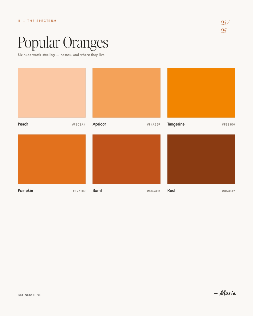
Control the shade, control the message. This is everything with orange. A bright, saturated, candy-orange screams fun, cheap, loud, energetic — great for a kids’ brand or a clearance sale, risky for a luxury studio. But shift it: a burnt orange, a terracotta, a warm rust or copper, and suddenly orange is sophisticated. It’s earthy, expensive, editorial, grown-up. (This is exactly why my own brand leans into a burnt copper rather than a bright pumpkin — same color family, completely different income bracket.) The difference between “cheap orange” and “luxury orange” is almost entirely saturation and depth. Mute it and warm it, and it grows up instantly.
Use it as your brave accent. Orange is phenomenal as the one warm pop against a calm, neutral palette. A whole page of cream, charcoal, and soft black — and then one burnt-orange button or underline? That’s not loud. That’s intentional. It reads as a deliberate design choice, which is exactly the energy you want. we actually use this on Refinery Nine. Orange against neutrals is one of the most quietly expensive-looking moves in the book.
Reach for it when you want to feel human. If your brand’s whole problem is that it feels stiff, corporate, cold, or forgettable, orange is your fix. It injects warmth and personality instantly. It’s perfect for brands that want to feel approachable, friendly, creative, and real — coaches, creatives, food, hospitality, anyone whose entire pitch is “you’ll actually like working with me.”
Be intentional about “cheap” if cheap isn’t the goal. If you’re a premium brand, keep bright primary orange on a short leash. Pair it with sophisticated neutrals, give it room to breathe, choose the muted version, and never let it be the loudest thing on a page that’s trying to look high-end. Orange will follow your lead — it just needs you to lead.

The Takeaway
Orange is the color most people are too cautious to use, which is exactly why it works so well when you’re brave enough to try. It’s warm, it’s friendly, it’s energetic, and it has a personality almost no other color can match — that rare mix of confident and approachable.
The only thing standing between “cheap orange” and “expensive orange” is intention. Pick the right shade, give it the right neighbors, and let it be the warm handshake your brand has been missing.
So don’t apologize for liking orange. I don’t, and “oranges are delicious”. SO Lean in. In a world full of brands playing it safe in blue, a little warmth is a competitive advantage.
Next up: Yellow — the happiest color in the room, and the most dangerous to get wrong.
The Psychology of Color, Part 2: Orange — The One Nobody Picks (And Probably Should)
If you click on my affiliates/products/advertisers links, I may receive a tiny commission. I only recommend products and services I use and believe in.
Maria
Refinery Nine is a brand and website design studio serving small businesses and creative entrepreneurs in the Hudson Valley and beyond. We design on Showit — and we do it really, really well.

