Share:
The Psychology of Color, Part 1: Red — The Loudest One in the Room
Let’s start with the troublemaker.
If colors were people at a party, red is the one who walks in and the whole room turns before they’ve said a word. Red doesn’t wait to be noticed. Red doesn’t do subtle. Red shows up, plants itself in the middle of the room, and dares you to look away — and you can’t, because biologically, you’re not built to.
That’s not a metaphor, by the way. That’s your nervous system.
The Feeling
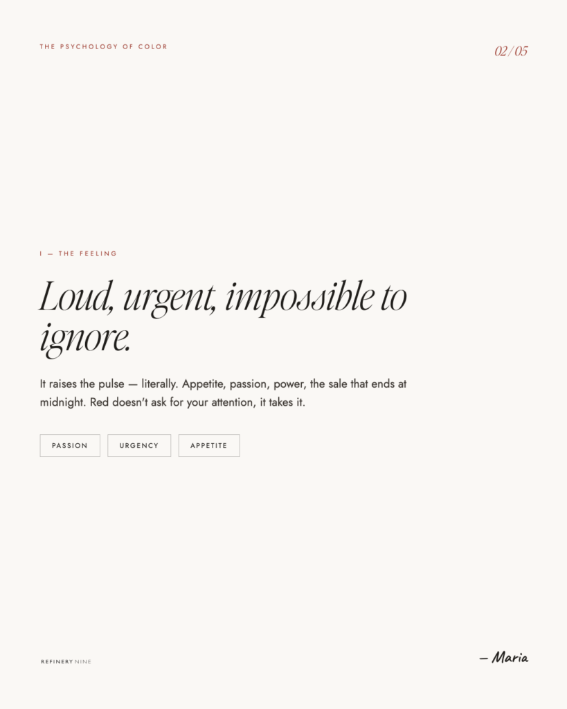
Red is the only color that comes with a physical receipt.
Studies have actually clocked it: looking at red can nudge your heart rate up and quicken your breathing a little. It’s the color your body reads as pay attention right now. Which makes sense, when you think about what red has meant for most of human history — blood, fire, danger, ripe fruit, the face of someone who is either very into you or about to lose it. None of those are “eh, I’ll deal with it later” situations. Red is a color that evolution taught us to respond to fast.
So when you put red on something, you’re not gently suggesting. You’re grabbing a wrist. That’s why it’s on stop signs, fire trucks, clearance tags, and that little notification dot that ruins your peace every morning. Red got the job because nothing else interrupts you quite as efficiently.
And here’s the part that’s easy to forget: red doesn’t have an “off” switch. You can’t use it casually. The second it enters your design, it’s the main character. Everything else becomes supporting cast.
The Meaning
Now here’s where red gets complicated — because red has been carrying baggage for about ten thousand years, and it does not all match.
Red is love. Red is also rage. It’s the heart-eyes emoji and it’s the brake lights. It’s romance and it’s a warning. It’s the most contradictory color in the entire spectrum, and it pulls all of it off at the same time, depending entirely on context.
Think about how much range one color is doing:
Red is passion — Valentine’s, lipstick, the dress you wear when you mean business of a different kind. Red is power — the red-carpet, the red tie a politician wears when he wants to look like he’s in charge, the bottom of a very expensive shoe. Red is appetite — there’s a reason so many fast-food logos are red, and it isn’t an accident; it’s practically a food group at this point. And red is danger — stop, warning, error, do not.
And then it switches passports entirely depending on where you are in the world. In much of the West, red leans danger and passion. In China, red is luck, joy, and celebration — it’s the color of weddings and money envelopes, not warnings. Same wavelength, completely different story. Color meaning is never universal, and red is the loudest proof of that.
So when someone says “red means passion,” what they actually mean is “red means passion, and danger, and power, and hunger, and luck, and whichever one of those wins depends on everything around it.” Cute fortune-cookie line. Useless on its own.
The Move
Okay — so how do you actually use this thing without setting your brand on fire?
Treat red like hot sauce, not the main dish. A little goes a shockingly long way. One red button on a calm, neutral page pulls the eye straight to it like a magnet — that’s the entire strategy behind the “buy now” button. Drown the whole page in red and you’ve lost the trick; now nothing stands out because everything is yelling. Restraint is what makes red work. (You knew I’d get there.)
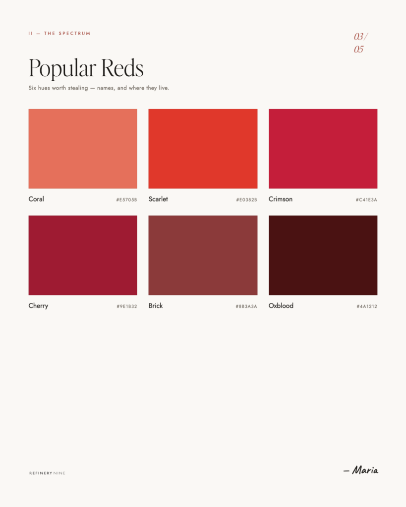
Pick your red on purpose, because reds are not interchangeable. A bright fire-engine red is energy, urgency, fast food, big sale. A deep brick or oxblood red is grounded, heritage, expensive, a little vintage — think leather-bound, old-money, this-business-has-existed-since-before-you-were-born. (That brick red in my own work? Chosen on purpose. It’s confident without screaming.) A bright cherry red and a moody burgundy send completely different messages even though they’re technically cousins. Choose the one that matches what you’re actually selling.
Use it when you want action, calm it down when you want trust. Red is fantastic for energy, urgency, appetite, and “do this now.” It’s a tougher sell for industries that need you to feel safe and unhurried — finance, healthcare, anything where “elevated heart rate” is the opposite of the vibe. There’s a reason banks pick blue. (More on blue later — it’s the responsible sibling.)
Respect the danger setting. Because red also means error and warning, be careful where it lands. Red text can accidentally read as “something’s wrong.” A red-heavy form can feel stressful instead of inviting. Red is an interruption by nature — make sure you’re interrupting people on purpose, not by accident.

The Takeaway
Red is the boldest tool in the box and the easiest one to misuse. It’s a color that physically can’t be ignored, which is exactly why it’s so powerful — and exactly why it’ll wreck your design if you let it run loose.
Used with intention, red is confidence. It’s appetite. It’s look here, this matters. Used without it, red is just noise wearing a nice outfit.
So the next time you reach for it, ask the only question that matters: do I actually want everyone to look here? If yes — perfect, that’s what red is for. If you’re just adding it because the design felt a little flat? Put it down. Step away. We’ll find you something that doesn’t bite.
Next up: Orange — red’s friendlier cousin, the one who never got the credit it deserved.
Refinery Nine is a brand and website design studio serving small businesses and creative entrepreneurs in the Hudson Valley and beyond. We design on Showit — and we do it really, really well.
Maria
If you click on my affiliates/products/advertisers links, I may receive a tiny commission. I only recommend products and services I use and believe in.